Here to Play: The Story Behind Hubert Studio’s Branding
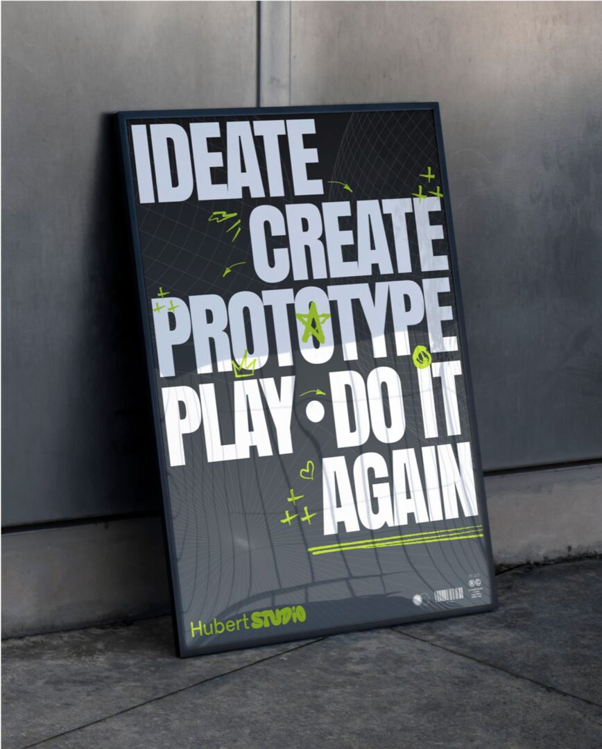
At Hubert Studio, we see gaming as more than play—it’s culture, community, and creativity. When shaping our brand identity, we wanted every element to reflect that spirit: bold, playful, and built for connection. Our branding captures the thrill of play itself: the spark of imagination, the energy of collaboration, and the joy of creating something new together.
A Brand That Blends Structure and Play
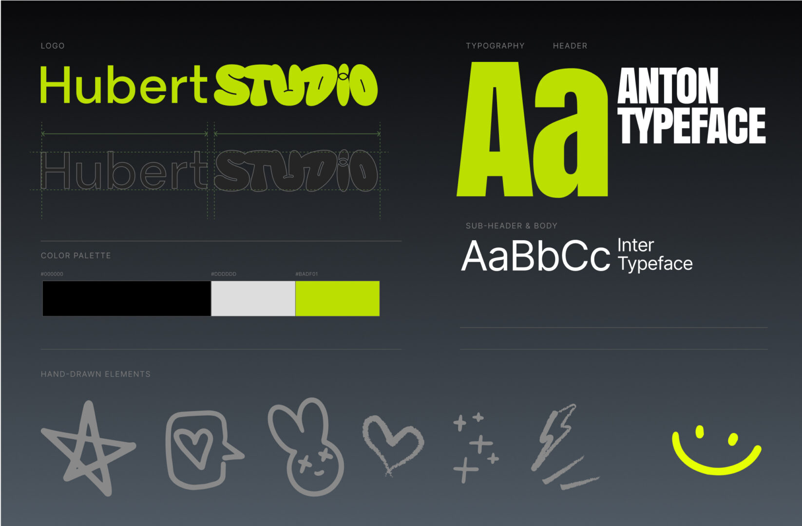
The Hubert Studio logo is a fusion of clarity and creativity. The word “Hubert” appears in a clean, modern typeface, signaling professionalism and trust. In contrast, “STUDIO” bursts with personality—rounded, bold, and slightly irregular, almost as if it were hand-shaped.
This playful contrast reflects the dual nature of Hubert Studio:
- A creative agency that delivers professional, brand-driven solutions.
- A gaming studio where experimentation, fun, and imagination thrive.
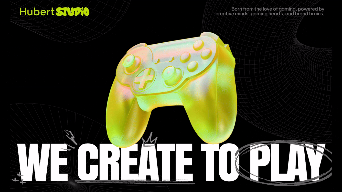
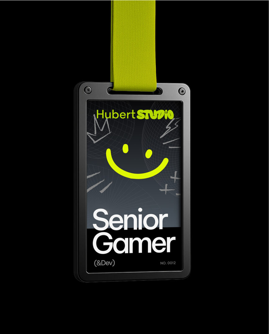
The rounded, fluid forms of “STUDIO” echo the bold blocks and playful circles in our visual identity, nodding to the modular building style of game design. Charged with our signature Neon Lime Green, the logo becomes dynamic, approachable, and impossible to miss—just like the worlds we create.
Our palette balances versatility with punch. Black, white, and grey provide a sleek, adaptable foundation—but the star of the show is Neon Lime Green (#E5FF02). This electric shade powers up our visuals, symbolizing energy, innovation, and the spark of creativity at the heart of Hubert Studio. It’s the highlight that keeps everything fresh and dynamic.
Graphics Inspired by Gaming
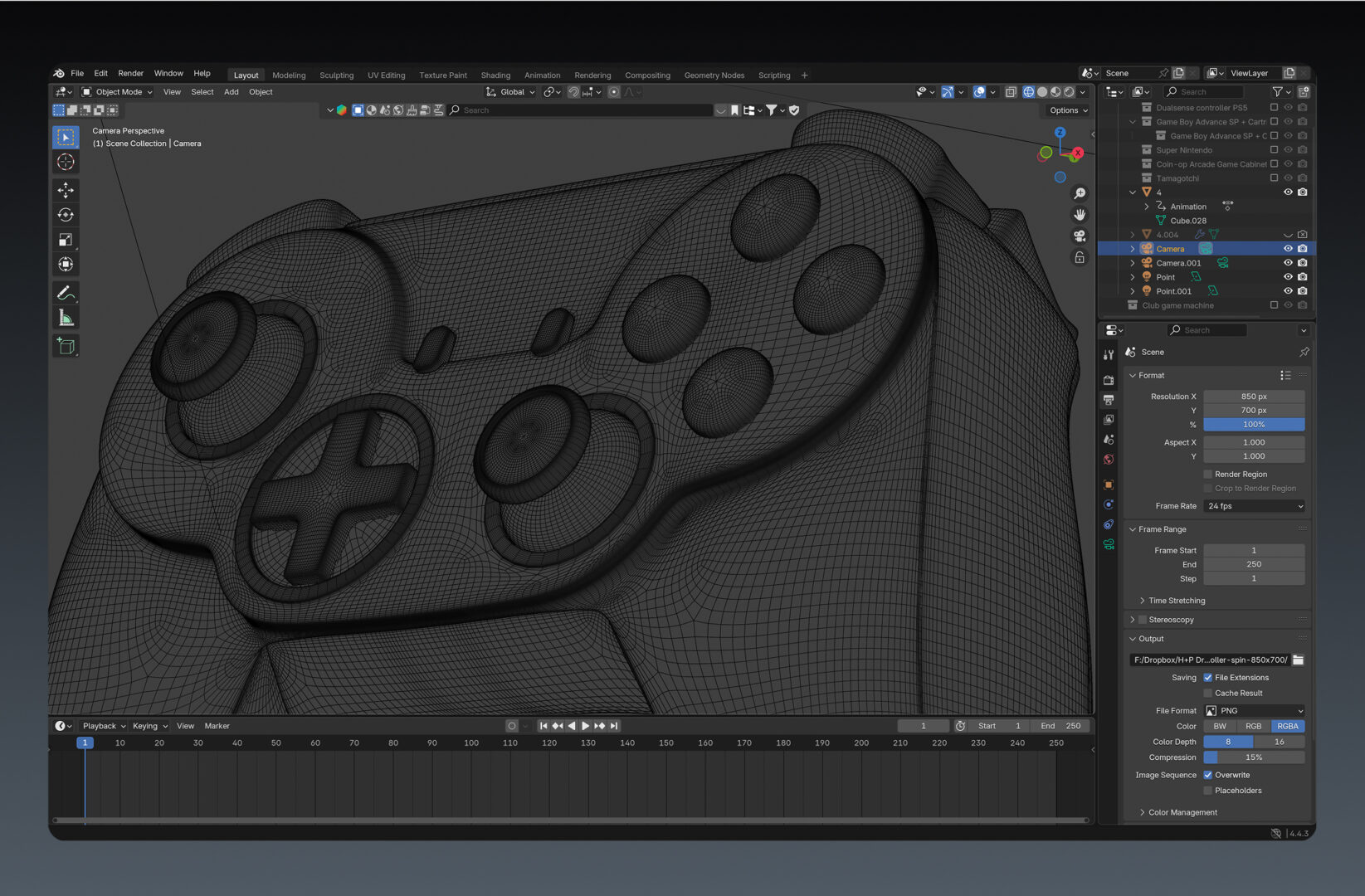
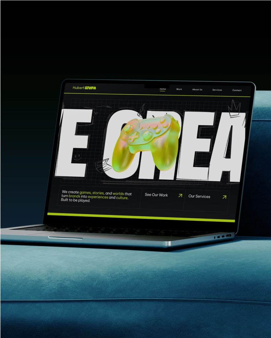
Our key visuals draw inspiration directly from game creation. Just as platforms like Roblox Studio use block-based coding to bring ideas to life, our branding uses bold blocks, modular shapes, and playful circles to represent creativity and interaction. It’s a design system that mirrors how players build, connect, and imagine inside virtual worlds.
Hubert Studio thrives where the community lives, on social. Our posts mix bold graphics, neon highlights, and clean layouts to speak in a fearless, youthful voice. From rallying cries like “Game Changer” to hashtags like #CREATIVE, our visuals are designed to energize and engage. Even our use of emojis is intentional: fun, but always on-brand.
Recap
In the end, Hubert Studio’s branding is about more than design rules. It’s about creating a space where bold ideas flow, communities connect, and brands can harness the power of play. Every logo, color, and graphic is a reminder: we’re here to create, here to collaborate, and always, here to play.